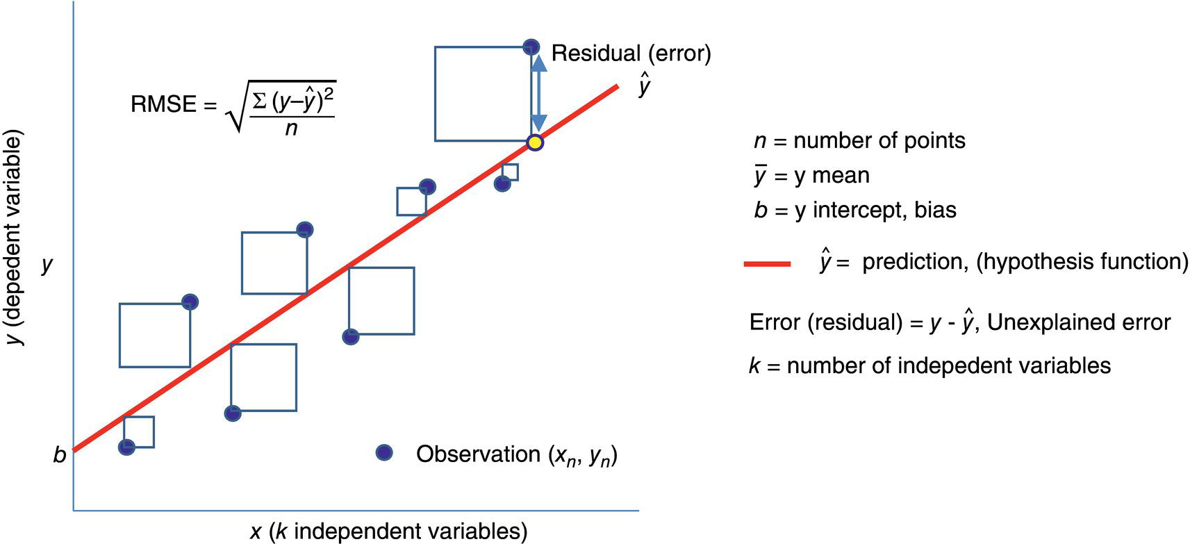
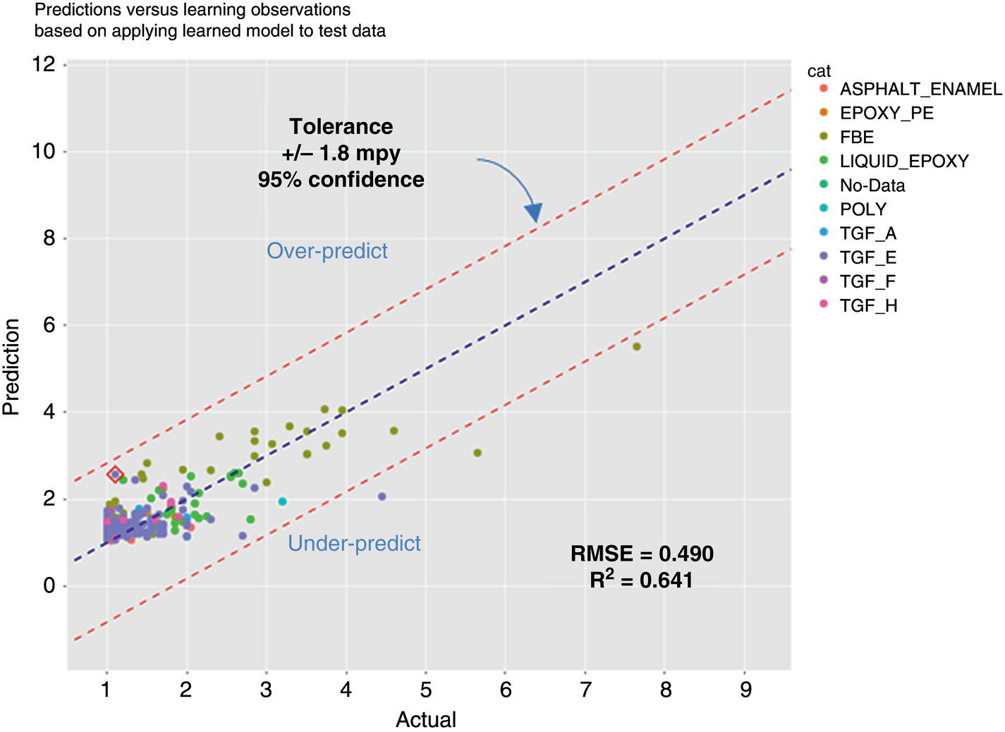
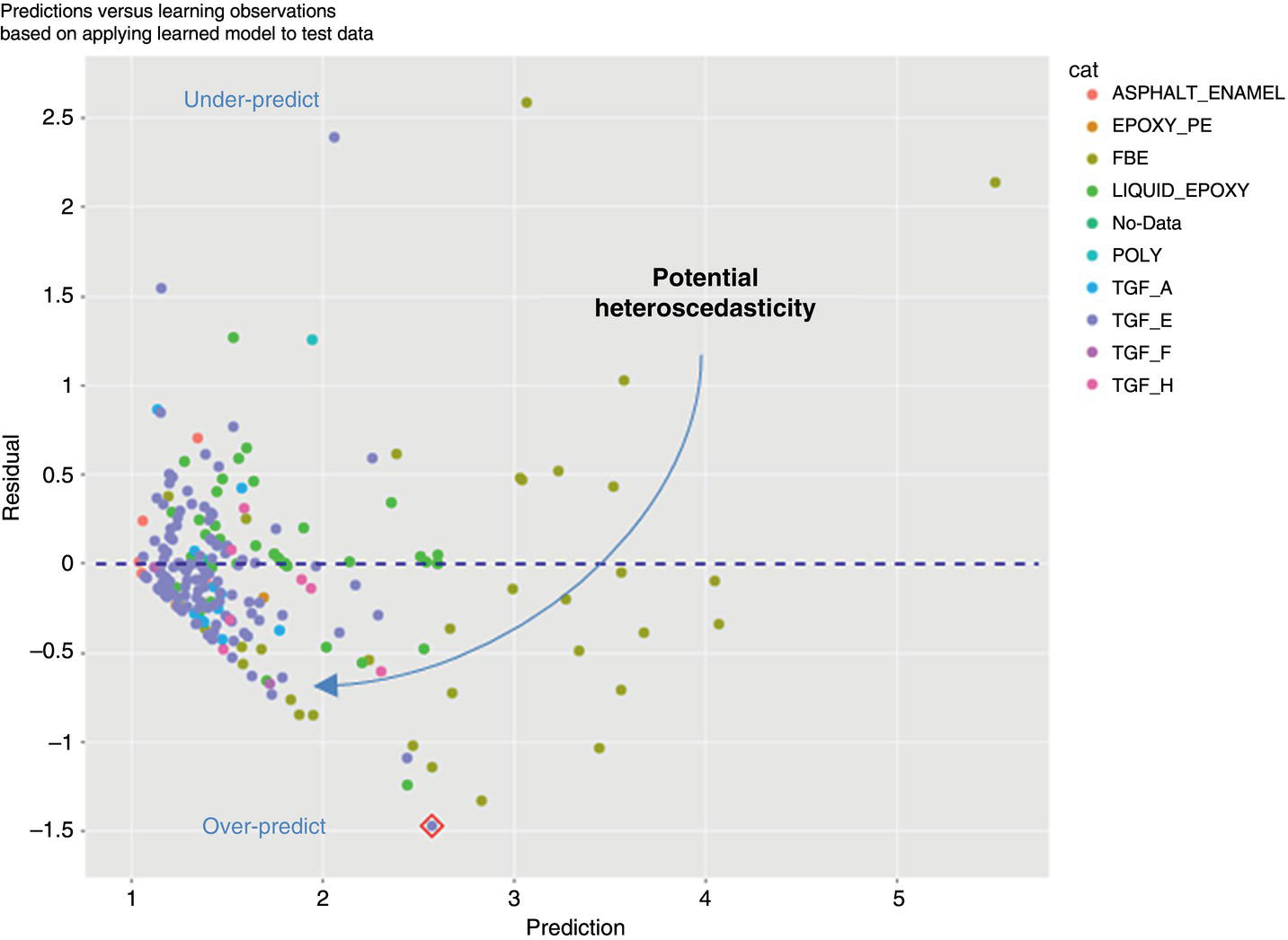
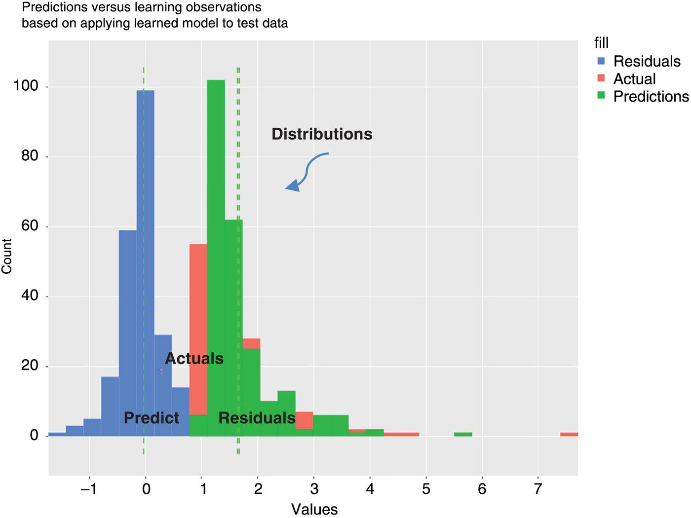
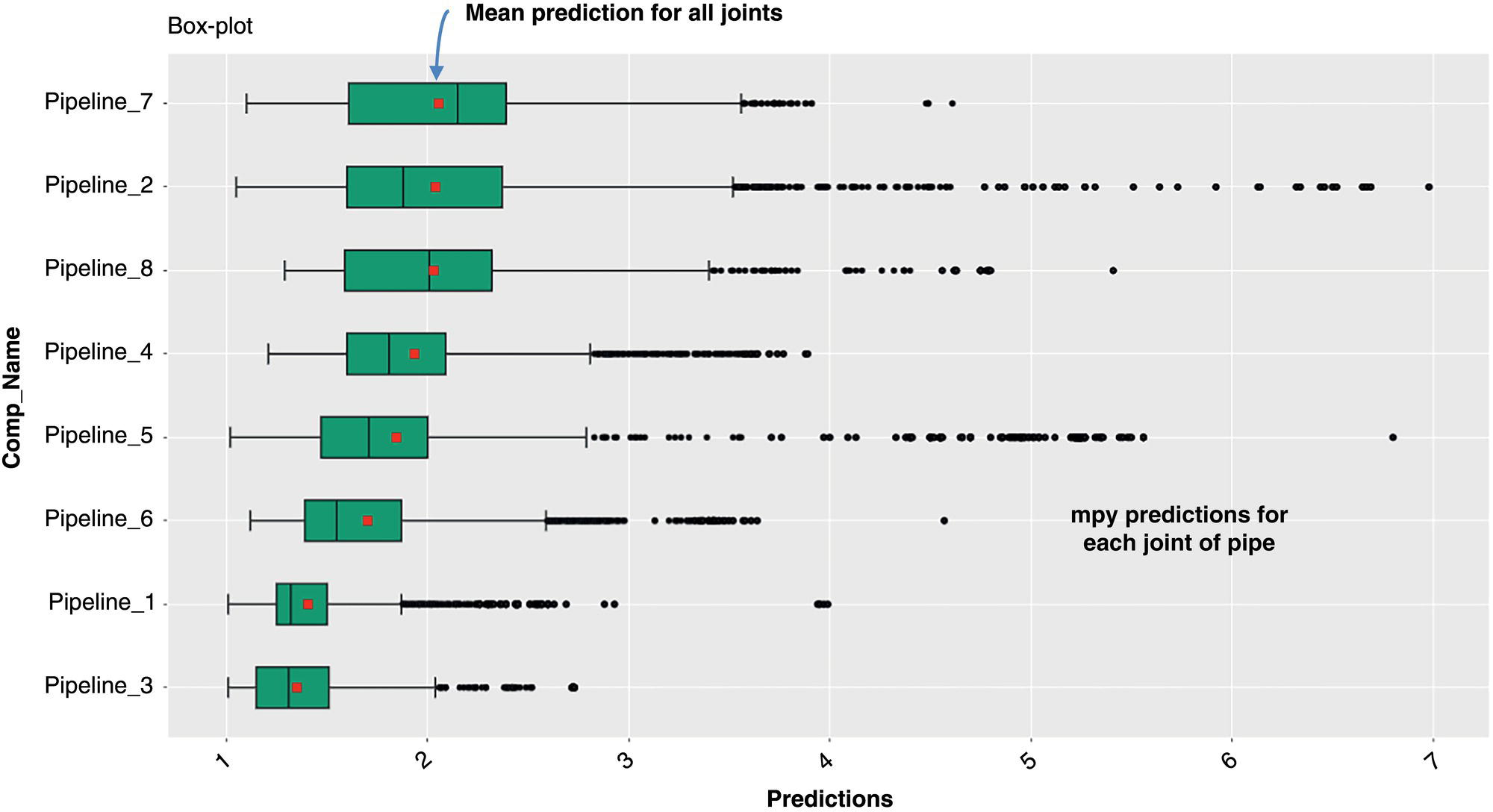
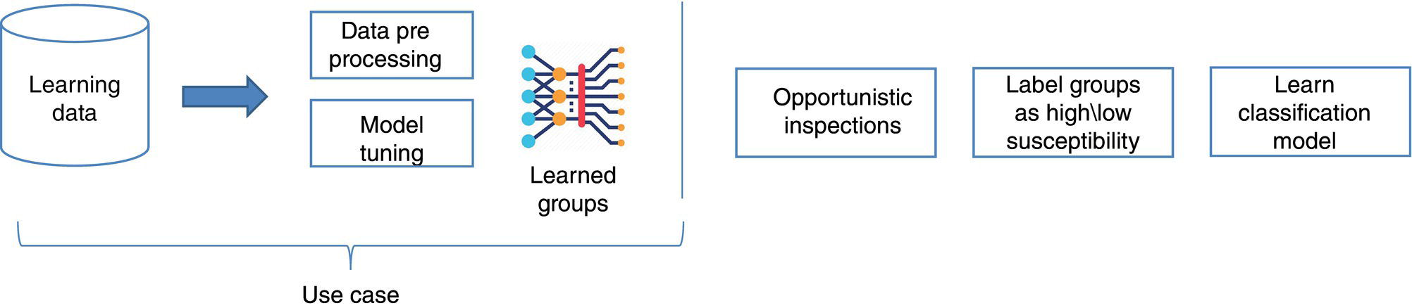
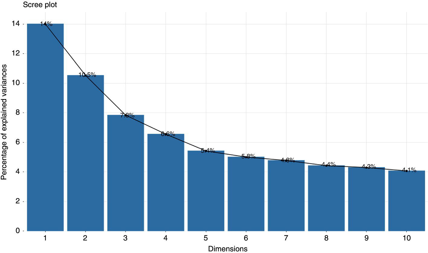
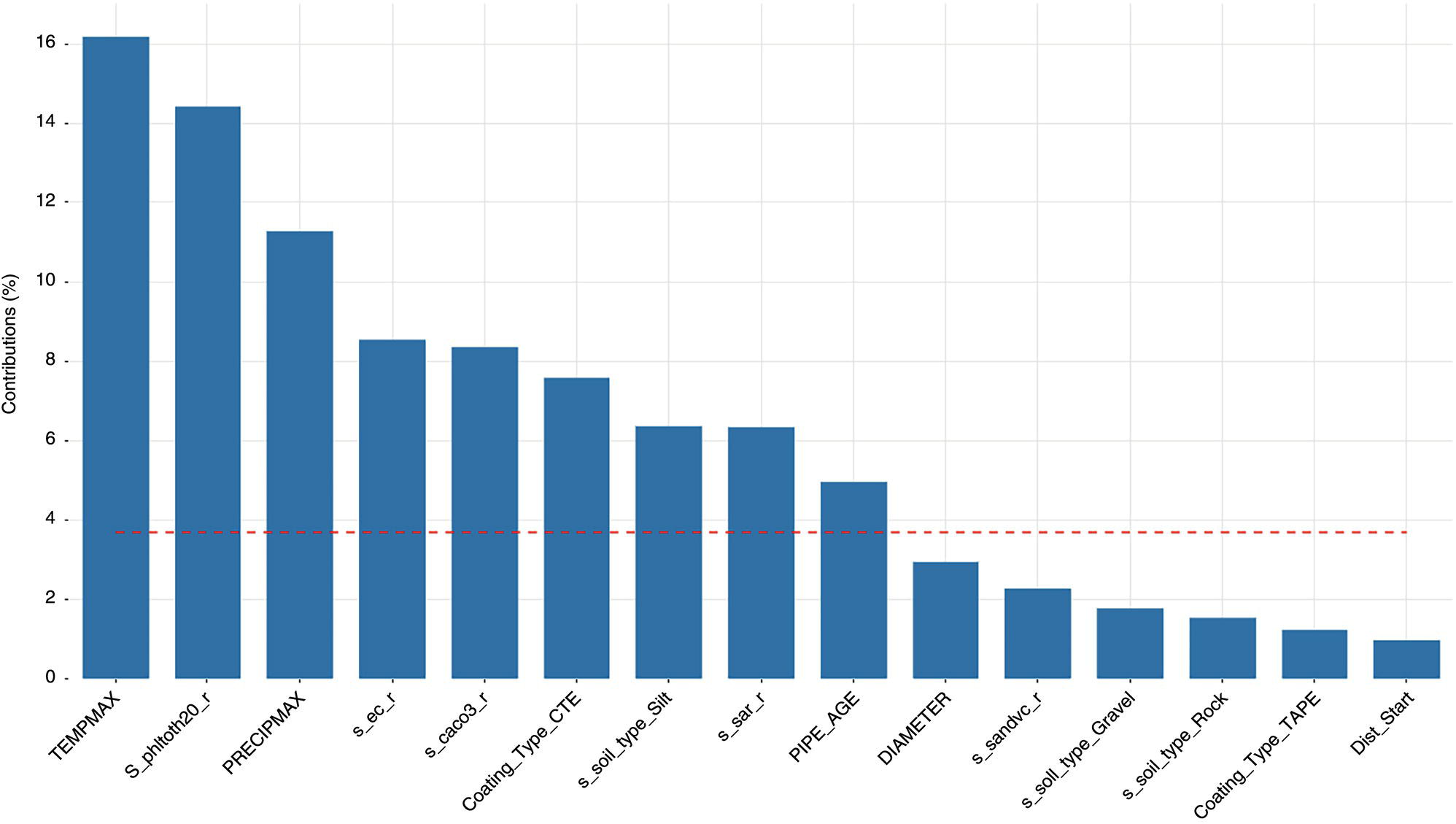
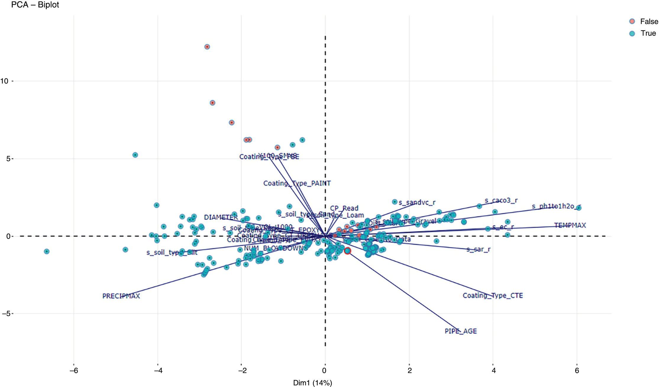
Michael Gloven Pipeline-Risk, Denver, CO, USA This chapter provides a basic introduction to machine learning and how to apply it to pipeline integrity management. The content is suitable for integrity practitioners with minimal experience in machine learning and is intended to provide a foundation for further study and use to support pipeline integrity. The overall objective is to provide the integrity practitioner with important concepts in preparation for undertaking and successfully implementing a machine learning project. Three generalized integrity use cases are presented to illustrate the most common machine learning processes: (1) supervised classification learning for assessing third-party damage susceptibility, (2) supervised regression learning for predicting external corrosion growth rates, and (3) unsupervised learning for assessing stress corrosion cracking (SCC) susceptibility. Each use case is based on actual projects; however, the data and results have been generalized to simplify the communication of what is important to the success of a machine learning project. Furthermore, this generalization recognizes that each pipeline owner is expected to have variations in their design, maintenance, and operating processes and as such the specifics of the learned models presented herein may or may not be applicable to their circumstances although the process is fundamental to supporting the stated use cases. Machine learning is a field of study focused on “learning” models based on sample data, known as training data, for the purposes of gaining analytical insights, discovering useful patterns, and making predictions. Machine learning supports integrity management objectives through its ability to efficiently process large disparate data sets to reveal useful patterns, capture patterns as models, apply models to similar pipelines to make predictions, and validate and measure the uncertainty of these models based on held-back data the model has never seen. The explicitly validated data-driven learned models have the expectation to support improvements in integrity management outcomes such as improved safety, reliability, and compliance. Numerous resources are available to get started with machine learning. Both free and paid for online courses with or without degrees or certifications are available [1]. Open-source software such as R Tidymodels [2] or Python Sci-Kit Learn [3] also has free and paid for platforms and extensive professional communities for learning. The use cases presented in this chapter are based on open-source POSIT Tidymodels and libraries managed in an RStudio IDE [4]. Tidymodels was selected based on its access to an extensive machine learning library, flexibility, ease of implementation, and user community support. In addition to Tidymodels, software programming skills using R, Python, Java, html, and SQL were required in support of each use case and technical discussion, which is beyond the scope and intent of this chapter. The field of machine learning continues to evolve with new applications, software structures, and methods. No one resource is currently available to keep up with all changes; however, certain websites [5–7] can inform the practitioner of important developments in machine learning. For an overall view of the potential impacts and concerns of machine learning-based artificial intelligence (AI) across all domains, the author suggested reviewing OpenAI [8] as a source of latest developments and thought leader of what’s to come in the future. A learning method is a way of identifying useful patterns and learning models to make predictions or analyze a particular problem. There are hundreds of learning methods to choose from, and the choice generally depends on practitioner preference, method performance, interpretation and transparency, the particular use case, and the cost of learning and implementation. An overview of common learning methods can be found in the Master Algorithm [9], which categorizes hundreds of methods as Symbolist, Connectionist, Evolutionary, Bayesian, and Analogizer types. Tidymodels [10] also provides documentation of hundreds of methods contained in R-based libraries for popular methods such as classification and regression trees, support vector machines, neural networks, Bayesian inference, and multivariate linear regression, to name a few. The use cases in this chapter demonstrate techniques to evaluate and select the best methods from these extensive libraries. Supervised learning is a machine learning approach to finding patterns and learning models when observational or “labeled” data are known. Although there are hybrids, two main categories of supervised learning are available: regression and classification. Classification methods are used to learn binary or multiclass categorical labels, whereas regression methods are used to learn numerical labels. The output of a classification model is a level of confidence or probability that the label is true. The output of a regression model is a numerical value. For both regression and classification, the label is the learning column of data containing actual observations. The learning process expects a sufficient number of observations representative of the predicted population of interest. In the domain of pipeline integrity and related use cases, examples of observations include learning through metal loss or cracks reported through in-line inspections, encroachments reported through one call, cathodic protection deficiencies, and methane leaks detected through satellite hyperspectral imagery. Model learning is then based on these observations and relevant predictors selected by domain experts. The result is a model that may be used for making predictions of the label or analyzing a particular problem. Unsupervised learning is an approach to finding patterns and learning models for a label of interest when observational data are minimal or none. Unsupervised learning often supports a strategy of managing low-frequency threats since the approach is capable of classifying parts of an asset into common groupings based on relevant root cause predictor data rather than the label. Once groups have been identified, opportunistic inspections may identify if the threat is present in a particular group, thus narrowing the scope of future assessments or mitigations depending on whether the threat is observed in that particular group. Unsupervised learning is also capable of outputting learned models. Cross-validation (CV) is one of many sampling techniques that support supervised model learning and measurement of performance. Sampling simply provides an approach for iterating through known observational data into a loss function [11] to find the best fit for the selected method. The loss function attempts to minimize the error or missed predictions of the output pattern as it finds the best-performing model. Common loss functions are based on ordinary least squares for regression and accuracy (percent of correct calls) for classification. Gradient descent [12] is a mathematical technique to find local minimums as part of the loss function process. CV is fundamental to the learning process as it can learn on all seen data while at the same time providing a model performance vector (Figure 3.11). Learning data are divided into folds, and a model is learned for all folds except one, which is held out for validation. The process performs this learning for each fold, and the final performance of the model is the average validation of all folds, whereas the final model is learned based on using 100% of the data. The resulting model is then tested with a separate held-back unseen data set comparing model predictions to unseen observations. This two-step process of CV and testing is recommended for model learning [13]. A learned model is characterized by a performance vector, which represents how well the model predicts on either seen or unseen data. Seen data are data the model has already learned from, whereas unseen data are observational data the model has never seen. The best practice is to “validate” models using CV with seen data and then test the model with unseen data. CV is generally used to screen methods, tune hyperparameters, and select data preprocessing techniques. Testing is generally used to determine the acceptability of the final model for business use. As will be presented in the use cases, performance vectors are characterized differently depending on whether the model is classification or regression. Figure 3.1 Cross-validation. An early step in a machine learning project is the identification of the required data, where it is located, cost of acquisition, format, quality, and whether there are lower-cost data proxies available. Domain experts and industry guidance provide a starting point for determining the data to integrate into the process depending on the use case. Machine learning is an iterative process; as models are learned, more or less data may be introduced into the learning depending on performance expectations. The best practice is to integrate data using a database technology to support scalability, sharing, and consistent management of metadata. Besides the integration of observational and predictor data into a database, the structure should include the use of a common geospatial or linear locational reference, temporal descriptors, naming conventions, and an asset hierarchy that organizes all data. Metadata should be standardized and exclude special characters or long lists of attributes. Open-source data sets relevant to pipelines in the United States are provided by ESRI, the National Weather Service (NWS), the Natural Resources Conservation Service (NRCS), and the US Census, to name a few. Although there are no comprehensive metadata dictionaries currently available to reference all potential label and predictor data for pipeline integrity, sources including PODS [14] and a review of industry standards such as API, ASME, and NACE provide a good starting point for identifying relevant data. The quality of the integrated data set for the particular use case should include checking for missing data, low variance data, skewed distributions, and outliers. Missing data are problematic with most machine learning methods as many methods use vector distances (observations in n-dimensional space), and a NULL in the vector space will most often cause the learning process to fail for that particular observation. Missing data may be mitigated through a separate learning process or simply assumed (mean, median, industry default, etc.). Predictor data variance is important since zero or low variance data offer minimal opportunity to reveal useful patterns. These data should be removed or investigated for improvement. Unbalanced or skewed label data are problematic since the majority class may overwhelm the minority class, that is, the signals from the important positive minority class may be masked by the majority class. Unbalanced data are common in the pipeline industry as incident rates are relatively low (most pipelines do not fail), and there are typically more negative than positive observations. Unbalanced distributions may be mitigated through upsampling, downsampling, weighting, or Box–Cox [15] methods. In addition, outliers of observational and predictor data should be investigated by domain experts for correctness prior to learning. Box plots, scatter, and histogram diagrams provide good visualizations in support of investigating potential outliers. For classification, defining a learning observation record requires the definition of the “segment” length of the pipe under consideration. Typical definitions include defining a segment each time an important predictor changes or simply normalizing all observations to joints or lengths of pipe. Classification requires segmentation to support the definition of both true and false classes or multiclassification attributes. Regression learning does not require this type of segmentation; however, consideration should be given to false, zero, or undetected observations. For both classification and regression, the integrated prediction data set should be contiguous defined segments to support the application of the accepted use case model across the entire pipeline or network. All predictor and observational data exist in a window of time, and this should be identified during the data integration process. For example, associating a new repair pipe or coating with the repaired defect may lead to poor model performance since the observation is associated with incorrect predictor data. The learning should associate the predictor data present when the defect was found. Management of relevant windows of time for all data is a consideration when any data changes over time. Time series learning is a technique supporting time-based predictions but is not presented in this chapter. Characterizing observational and predictor data as normalized temporal or rate data is a recommended option for time series analysis. Off-pipe, close proximity, or sequentially adjacent data should be identified and included in the learning if possible. For example, landslide areas, waterways, high-consequence areas, weather stations, or high-density defect areas may not intersect the pipe section under analysis but might be in close proximity and relevant to the use case. Domain expertise is required to assess how far off the pipe section the data predictor exists for it to be a potential influence on the label. Preprocessing is the requirement to prepare data for the learning method and includes techniques such as data normalization, range scaling, encoding, and distribution shaping. Normalization is standardizing all data to the same scale, such as 0–1, and range scaling is further standardizing all data to a scale of standard deviations. This way, all predictor data are represented numerically in terms of a number of standard deviations, and certain methods are not unduly influenced by larger predictors (i.e., soil resistivity in thousands versus soil cp in decimals). Encoding is the conversion of categorical data to new columns of integers, as most methods require attribute lists to pivot to columns and then assign 0 or 1 depending on whether the attribute is true or false. Shaping is a technique to correct nonnormal or skewed data. Although there are many preprocess considerations, these practices are the primary preprocessing methods intended to support model optimization and representation of all data in numerical vector space. Consider a use case to learn a model to assess the susceptibility of third-party damage based on observations of line hits, near misses, top-side dents, and coating damage on a sample of pipelines. The objective is to learn a threat susceptibility model and apply it to the overall pipeline system for the purpose of identifying areas more susceptible to third-party damage and allocating threat mitigation resources. We apply a supervised classification learning process to learn and validate a model to measure the susceptibility to third-party damage (Figure 3.2). Recall that supervised learning is a machine learning approach to finding patterns and learning models when observational or “labeled” data are known, and classification methods are used to learn binary or multiclass categorical labels. The training data for our case include ~265 miles of pipelines comprising 34,995 joints where each joint of pipe is called out as a “Yes” or “No” depending on evidence of a positive third-party hit, near miss, violation, or top-side damage. All joints are integrated with a nonexhaustive list of 9 potential predictors previously identified by domain experts (Table 3.1). There are 123 positive “Yes” observations across the 265 miles, and the training data are preprocessed and further randomly divided into learning data (80%) and test data (20%). Preprocessing includes upsampling the minority class “Yes” to equal the number of records of the majority class “No,” and all data are centered and scaled for learning. Figure 3.2 Supervised classification learning. Table 3.1 Third-Party Damage Predictors The learning data are used to train several methods using CV. A random forest (RF) [10] method is initially selected based on a receiver operating characteristic (ROC) (Figure 3.3) analysis, which plots cross-validated true-positive versus false-positive rates. The method with the greatest area under the curve performs best in terms of accuracy within binned confidence levels. In other words, this method is able to correctly call actual “Yes” or “No” observations better than the other methods. The diagonal line represents a fair coin flip. Some methods have hyperparameters, whereas others do not [10]. Tuning hyperparameters and learned coefficients are dependent on the method’s mathematical construct, for example, tree models may have hyperparameters for tree depth, interaction, minimum observations per node, etc., whereas a linear regression model may have coefficients but no hyperparameters. Coefficients are learned and represent the influence of the predictor on the prediction. RF has no coefficients but has one hyperparameter “mtry” which is the number of predictors to sample for each tree. A grid search method using a loss function of accuracy was used to find an optimal mtry of nine for the initial iteration. Grid search is a method to find optimal combinations of hyperparameters based on a provided range of values. Figure 3.3 Example ROC. The CV process is used to find the initial best method, preprocessing settings, and hyperparameters. The next step is to test the model against observations the model has never seen. The results will guide the practitioner on the acceptability of the model for production use or whether another iteration is required through the CV learning process to modify the method, preprocessing, predictors, sample size, or hyperparameters to achieve an acceptable level of performance. We use two tools to assess model performance and iterate improvement options: a confusion matrix and learning curves. Figure 3.4 Confusion matrix. Classification performance is based on how well the model predicts the labeled class. A binary model will have two classes, whereas a multiclass model will have more than two classes. A class can be “Yes,” “No,” “True,” “False,” etc., or a list of categories of multiclassification. Classification performance is represented through a confusion matrix which summarizes correct and incorrect calls against test data. A classification model will output a probability of a particular class, and the class prediction is based on a threshold. If a model predicts 60% probability of third-party damage and the threshold is 50% for a true call, the class call will be predicted true. If the threshold is set at 70%, the same call would be predicted to be false. Thresholds are set based on the particular use case and consideration of the cost of false positives versus false negatives. A false positive is a positive prediction that is actually negative, and a false negative is a negative prediction that is actually positive. A confusion matrix is a tool to assess and communicate performance based on a stated threshold. Classification performance is characterized by several metrics, the key ones being accuracy, sensitivity, and specificity, all for a given threshold. Accuracy is the percentage of correct calls, sensitivity is the percentage of correct actual true predictions, and 1 minus specificity represents the percentage of false positives. For our use case, we are particularly interested in sensitivity as we are more concerned with finding positives than negatives. This is because the potential cost of a missed positive (potential incident) is much greater than the potential cost of a missed negative (false positive). Figure 3.4 is a confusion matrix for our an initial iteration of our use case using the test data of 5999 joints, a 50% threshold, and the initial RF model. Although the accuracy is high, the model was unable to reliably predict actual positives at the threshold. We then decided to iterate again through the CV process, this time selecting an xgbTree method [10] using the same preprocessing steps and grid-tuned hyperparameters. Although sensitivity is still low, the xgbTree performs better in predicting actual positives. The results herein are meant to present the process, and it would be expected that the practitioner would continue to seek out options to further improve this model, including modifying predictor data, improving sample size, changing methods, preprocessing and tuning, or revisiting the scope of the use case. Learning curves are used to compare CV and test results, assess model acceptability, optimize the learning process, and diagnose issues related to model bias and variance. Variance may be indicative of overfitting or too many predictors, whereas bias may represent underfitting or too few predictors. Variance and bias are categories of model errors that may be corrected by adding or removing predictors, improving the preprocessing of data, improving sampling, method selection, and hyperparameter tuning, to name a few. Variance may be detected when there is a large gap between CV and test performance. Bias may be detected when learning curves flatten out a certain performance and do not improve as x-axis values increase. Model improvement is an iterative process, and the practitioner has numerous options to improve performance. Figure 3.5 Learning curve method comparison. Comparing the sensitivity performance of the RF and xgbTree models at different thresholds shows that although accuracies are high for both, the xgbTree model was able to better predict the unseen positive observations (Figure 3.5). It should be clear that accuracy can be misleading in characterizing model performance of highly unbalanced classes, yet a focus on sensitivity could provide insights into options to improve performance in predicting the more important minority positive class at different thresholds. Through an iterative process including CV-based ROC curves, the confusion matrix, and learning curves, the xgbTree-based model was accepted as a candidate model. The practitioner is able to measure the contribution or importance of each predictor to the target of interest through several methods, including Model Weights, LIME [16], and Shapely [17]. Model weights are a human understandable representation of model predictor importance of values typically normalized between 0 and 100. Model weights are intended to provide relative guidance on predictor influence for either the positive or negative class at a global level and can be considered, in many cases, linear representations of nonlinearities (Figure 3.6). Depth of Cover (DOC) and presence of Structures have the largest weights as compared to the other predictors. Model weights are mathematically derived based on the particular method; R Tidymodels and Sci-Kit Learn have functions to extract these values from learned models. Not shown are LIME and Shapely values. LIME is a method to examine a prediction and find important values particular to similar predictions. Shapely is a game theory method to find the marginal contribution of each predictor to the prediction relative to the mean value of the training data. Model application occurs once the model meets acceptance criteria and new prediction data are ready. The best practice is to learn an applicability model and apply this to the new prediction data prior to predictions. The applicability model is learned using the same CV process and measures the “likeness” of the model-based training data to the new data. The concept is to only apply the third-party damage model to new pipelines that are similar to the training data. Figure 3.6 Model predictor importance. The previously mentioned software technologies have functions to apply models to data. Once results are available, boxplots are a useful tool to identify high susceptibility outliers and pipelines with higher average results. For this use case, the intent of the results is to guide when and where to apply mitigation resources. The predictor importance methods may be used to determine the optimal strategies or projects for mitigations. Simulation techniques may also be used to test various mitigation strategies. Box plots are used as a management tool to support this analysis and prioritization of mitigation resources. Figure 3.7 shows the results of applying the model to new prediction data (joints of pipe). The plots are sorted by the highest mean, and outliers are identified as points beyond the 1.5 QR whiskers. Consider a use case to predict external corrosion growth rates (CGRs) based on known observations of external corrosion wall loss from multiple inspections. The objective is to learn a CGR model that may be applied to the overall pipeline system for the purpose of planning and prioritizing the next inspections. Figure 3.7 Boxplot of prediction results. Figure 3.8 Supervised regression learning. We apply a supervised regression learning process to learn and validate a model to predict CGRs (Figure 3.8). Recall that supervised learning is a machine learning approach to finding patterns and learning models when observational or “labeled” data are known, and regression methods are used to learn numerical labels. The training data for our use case includes ~265 miles of pipelines comprising 34,995 joints where each joint of the pipe may or may not have an in-line inspection corrosion observation. The best practice is to learn from inspection calls that equal or exceed the corrosion reporting threshold, i.e., 10–15% wall loss. All observations are integrated with 18 potential predictors previously identified by domain experts (Table 3.2). There are 944 observations across the 265 miles ranging from 1 to 10 mpy, calculated based on anomaly matching between inspections. The training data are preprocessed and further randomly divided into learning data (75%) and test data (25%). Preprocessing includes record weighting [18] to place more importance on higher rates, upsampling to ensure coverage of all factor levels during CV, and all predictor data being centered and scaled for learning. The learning data are used to train several methods using CV. An RF method was initially selected based on the analysis model root mean squared error (RMSE) and R2 (Figure 3.9). RMSE and coefficient of determination (R2) are commonly used performance metrics for regression. RMSE represents the average squared error of predictions versus actual observations (Figure 3.10) and R2 is a 0 to 1 metric representing how well the underlying predictors explain the variation in the prediction. Lower RMSE and higher R2 are desirable for this use case. As presented in the classification section, some methods have hyperparameters whereas others do not. A grid search iterating over a range of values using a loss function of RMSE is used to find an optimal set of hyperparameters for the selected method. This is part of the learning process, but not discussed further for this use case. Table 3.2 External Corrosion Growth Rate Predictors Figure 3.9 Results of different regression methods. Figure 3.10 Plot of model RMSE. The CV process is used to find the initial best method, preprocessing settings, and hyperparameters. After model learning, the next step is to test the model against observations the model has never seen. The results will guide us on the acceptability of the model for production use or whether we need to iterate again through the CV learning process and modify the method, preprocessing, predictors, sample size, or hyperparameters to achieve an acceptable level of performance. We use two tools to assess model performance and iterate improvement options: a unity plot and learning curves. Three layouts of a unity plot are used to assess model performance. Each layout provides different representations of actual observations, predictions, and residuals (actual observations—predictions). The intent is to provide visibility into performance for model acceptance or improvements. The first plot (Figure 3.11) shows actual versus predicted values and supports the analysis of outliers and calculation of confidence. The plot shows ±1.8 mpy falls into a 95% confidence interval, and this provides a metric for identifying outliers and determining acceptable variation in the actual versus predicted results. Examination of the outliers indicates a relationship between coating type and outlier predictions. The plot guides the practitioner to further examine this relationship with regard to correctness and data quality. Figure 3.11 Unity plot of model test results. Figure 3.12 Plot of residuals and visualization of potential heteroscedasticity. The second plot (Figure 3.12) shows residuals versus predictions and is a test for heteroscedasticity, which could mean prediction errors could be nonnormal and the model could perform poorly on new data. This plot does show evidence of heteroscedasticity for lower value predictions and may require further investigation. Numerous methods are available to correct for heteroscedasticity [19]. The third plot (Figure 3.13) shows histograms of actual observations, predictions, and residuals. Of interest is the comparison of the actual and predicted means, which appear close, and evidence that the residuals follow a normal distribution, a requirement of many regression methods. Hypothesis testing may be performed to test the similarity of the means as a metric for model performance, i.e., the null hypothesis is the means are similar and the alternate hypothesis is that the means are not similar at a specified level of significance. Learning curves were presented in the classification section and will not be repeated in this section. Regardless, it is useful to plot RMSE and R2 versus sample size, predictors, and\or method hyperparameters to optimize the final model. The same principles of variance and bias error analysis apply to regression as they do to classification. Hence, the practitioner may use learning curves to resolve model errors, determine optimal sample size, and select predictors based on the selected performance metric, RMSE, R2, mean average error, or any other relevant metric. As presented in the classification, the practitioner is able to measure the contribution or importance of each predictor to the target of interest through several methods, including Model Weights, LIME, and Shapely. Consider Shapely (Figure 3.14) values for this use case. Shapely measures the contribution to mpy of each predictor for each prediction. The values shown are marginal contributions to the mean mpy for each predictor for a selection of pipe joints. Figure 3.13 Plot of results histogram. Figure 3.14 Shapley applied to prediction results. Shapely values are local, that is, they are used to interpret each joint of the pipe based on the model training data and predictions. For example, each point for the Coating predictor in the figure is a Shapely value for a joint of pipe. Values of mpy vary depending on coating type but also vary depending on the other predictors for the joint. Shapely reveals that there are nonlinear relationships between predictors and show the predicted contribution in mpy for each predictor on the joint. The results provide a method to compare potential mitigative options based on units familiar to the practitioner. The accepted model is applied to similar assets to predict corrosion growth rates. Similar to classification results, Box plots are used as a management tool to support the analysis and prioritization of mitigation resources (Figure 3.15). Using the guidance of predictor importance methods, mitigation options are evaluated for the high CGR outliers and pipelines with higher average CGR. Figure 3.15 Boxplot of CGR prediction results. Consider a case study to assess the susceptibility of high pH SCC. There are no observations of SCC in the training data to learn from, yet domain experts and industry resources suspect there are certain predictors that may influence the presence or nonpresence of SCC. This case study demonstrates a machine learning process to identify groups based on these predictors, also referred to as cluster analysis, to support the identification and mitigation of SCC (Figure 3.16). The objective is to identify higher susceptibility “learned” groups of pipelines for further investigation and inspection for SCC. As visual inspections are performed for other reasons, the asset owner will check for SCC. If SCC is found to be in a particular learned group, that group will be considered as a higher susceptibility to SCC. As this process matures, the groups may be used to learn a multiclassification model to identify higher or lower SCC susceptibility across a broader collection of pipelines. The learning data for our use case includes ~265 miles of pipelines comprising 34,995 joints where no SCC inspections have been performed. All observations are integrated with 16 potential predictors previously identified by domain experts (Table 3.3). All predictor data are complete, encoded, if an attribute list, and centered and scaled for learning. Figure 3.16 Unsupervised machine learning process. Table 3.3 SCC Predictors Cluster analysis is an unsupervised process for defining groups of data, although there are other strategies for cluster analysis [20]. Overall, the process is iterative and includes key elements of predictor selection by domain experts, predictor variance analysis, partition analysis, application of clustering algorithms such as k-means [21] and overall analysis through visual plots. These elements comprise the process for this use case which learns groups to inspect for SCC. Principal component analysis (PCA) [21], is a method to transform predictor data into a new dimensional space where all the components are orthogonal to each other. PCA is able to provide transparency into what predictors contain the most variance relative to others, which is helpful in defining the potential subset of data to use for the cluster analysis. The intent is to understand the predictors most likely to define the groups, which will be determined by the downstream k-means process. Figure 3.17 shows the application of PCA to the learning data. The 16 predictors are collapsed into 10 components, and the plot shows the variance captured by each. Although components 1 and 2 capture about 24% of the variance, it appears that variance is not captured by one particular component. Then, examining the contribution of predictors in Figure 3.18 shows the individual predictor contributions to the first component. In this case, temperature and soil pH are dominant and would be expected to influence the delineation of learned groups. Several predictors do not offer variance or useful information as they are low information contributors to the component. These predictors are often investigated for removal as they may be contributing noise or error to the process. Overall, PCA may be used to guide the inclusion or exclusion of data in the cluster analysis. Figure 3.17 Principal component analysis. Figure 3.18 Predictor contribution. Figure 3.19 is an eigenvector representation of components 1 and 2 and shows the strength of variance of each predictor. Examining the length of the lines (eigenvectors or strength of variance), it is clear that no one predictor dominates in variance. However, it is interesting to see how the joints of the pipe (lighter dots) show some natural separation, which will be important in the k-means process. The purpose of this plot is to guide decisions on retaining, including or removing predictors from the analysis. A key question to ask prior to continuing is how well the data partitions or separates. Hopkins statistic [22] is a metric to guide us on how well the data partitions. Values closer to 1 indicate the data should be partitioned or grouped well. Our use case has a statistic of 0.81 and we will continue with the analysis. If the statistic was lower, we would consider subsetting or adding predictors or seeking out data that offers more variance as guided through PCA. Another key question in k-means analysis is determining how many groups to create. k-means requires a guess on the number of groups or clusters to find and there are several methods to accomplish this task. We use the sum of squares for different values of k (clusters) and the point where we see the greatest change in this value is a good starting point for k. Figure 3.20 shows the greatest change at k equals 5 and we will use this value for k-means. k-means clustering is a method of vector quantization, originally from signal processing, that aims to partition n observations into k clusters in which each observation belongs to the cluster with the nearest mean (cluster centers or cluster centroid). In our case, n equals our learning data records and k equals 5. Figure 3.21 shows joints of pipe in a two-dimensional representation of multidimensional space where the labeled symbol indicates the centroid of each cluster. These clusters are expected to be most dissimilar from each other. Then, if several opportunistic inspections for each cluster are performed to look for SCC, and the joints of the pipe with evidence of potential SCC (positive observations), a pattern begins to emerge. Figure 3.19 Eigenvector plot. Figure 3.20 Estimating k. Figure 3.21 k-means cluster plot. It is clear from this analysis and sample inspections that two of the five clusters may be most susceptible to SCC. From here, the five clusters may be transformed into classes for learning a multiclass multiple to predict SCC across a broader system of pipelines. Machine learning in the context of this chapter is intended to demonstrate its potential value in the analysis and understanding of integrity threats. While the benefits seem clear, the practitioner is encouraged to be prepared to consider important issues of predictor correlation versus causation, the predictor power of a learned model, performance acceptance criteria, and the idea that models have limited ability to predict events that do not have a historical basis, similar to the approach of deterministic models. This chapter presented the fundamentals of machine learning in the context of three pipeline integrity management use cases. Each use case demonstrates the ability of machine learning to support integrity management objectives through the efficient processing of large disparate data sets to reveal useful patterns, capturing patterns as models, applying models to similar pipelines to make predictions, and validating and measuring the uncertainty of these models based on held-back data the model has never seen. The explicitly validated data-driven learned models have the expectation to support improvements in integrity management outcomes such as improved safety, reliability, and compliance.
3
Practical Application of Machine Learning to Pipeline Integrity
3.1 Introduction
3.2 Machine Learning Fundamentals
3.2.1 Overview
3.2.2 Getting Started
3.2.3 Learning Methods
3.2.4 Supervised Versus Unsupervised Learning
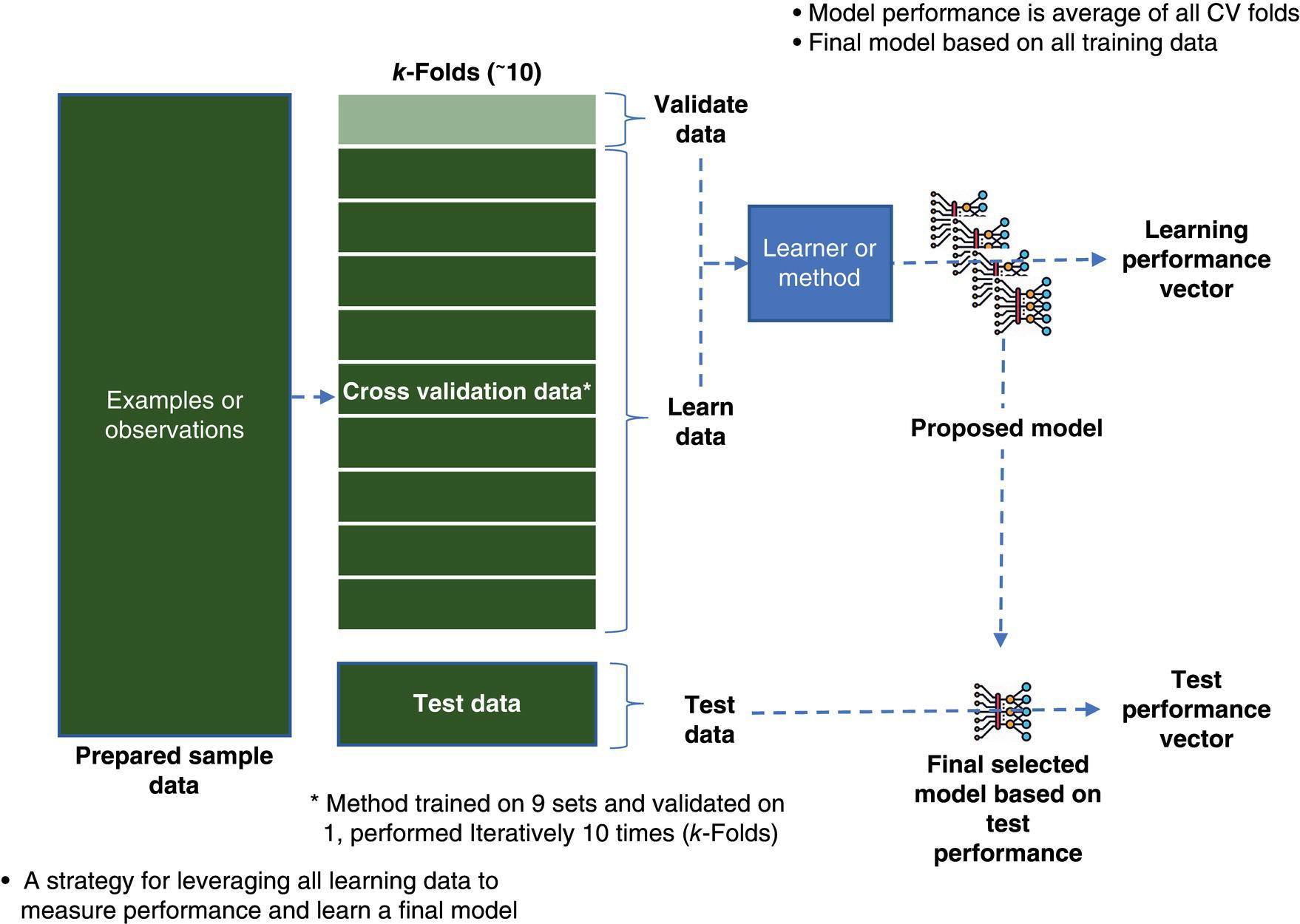
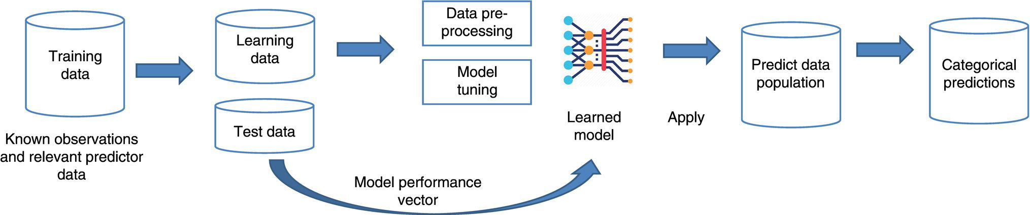
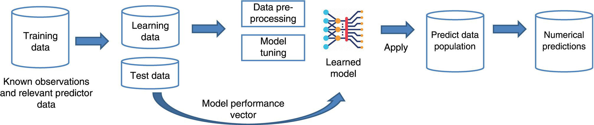
3.2.5 Model Cross-Validation and Testing
3.2.6 Model Performance
3.2.7 Data and Sources
3.2.8 Data Quality
3.2.9 Special Considerations for Pipeline Networks
3.2.10 Data Preprocessing
3.3 Supervised Learning—Classification
3.3.1 Third-Party Damage Use Case
3.3.2 Training Data
Example TPD Predictors:
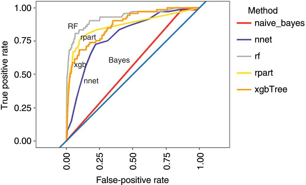
3.3.3 Select Method and Learn Model
3.3.4 Model Testing
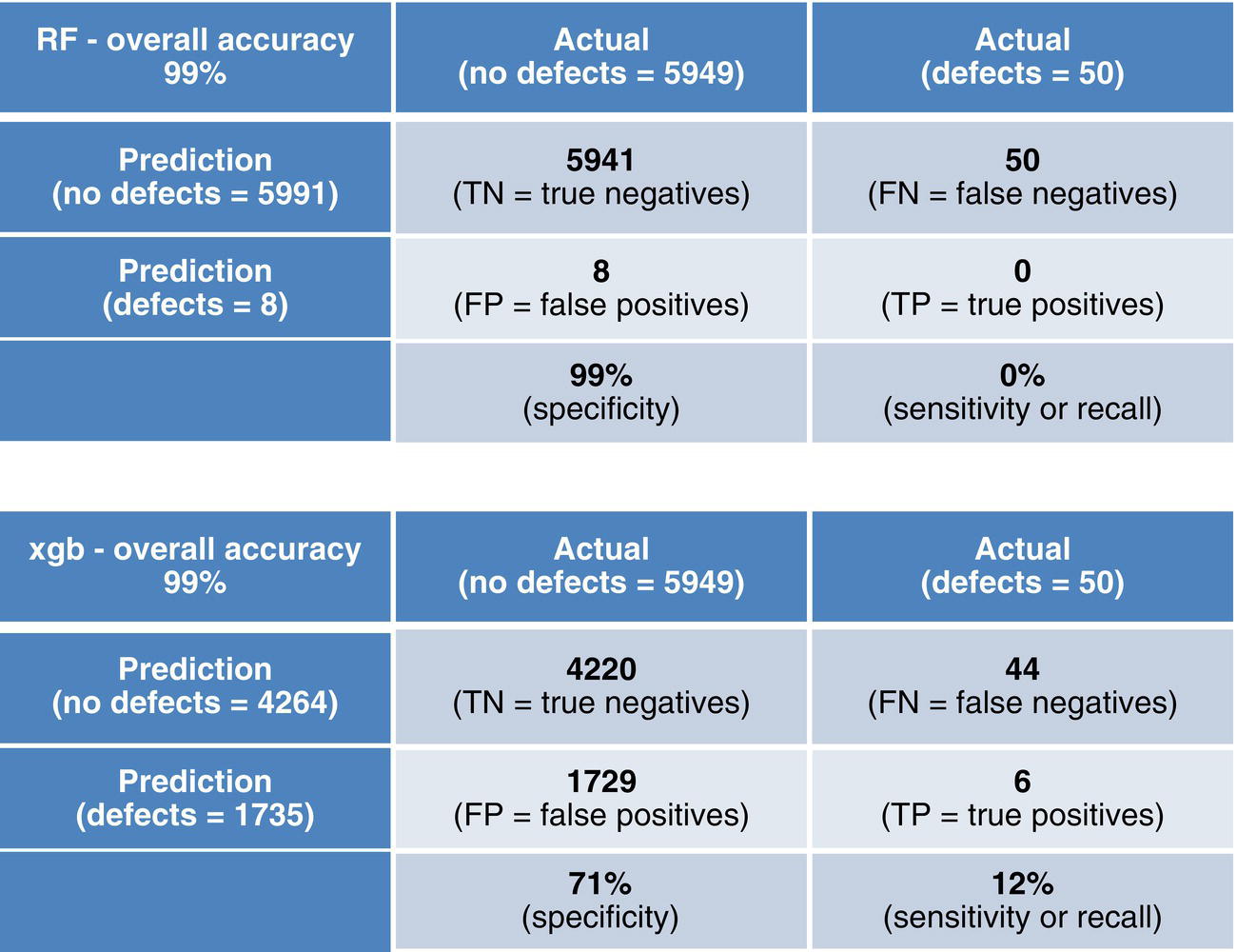
3.3.5 Confusion Matrix
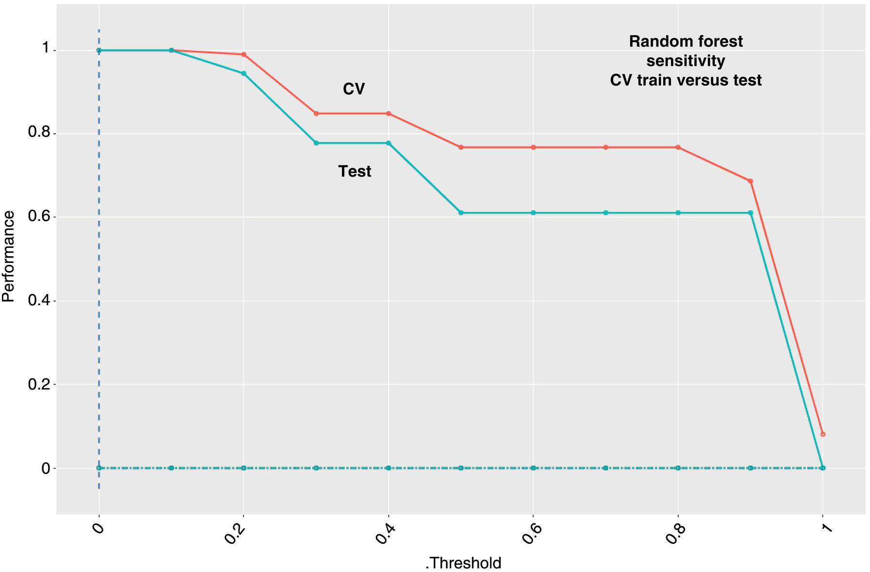
3.3.6 Learning Curves
3.3.7 Predictor Importance
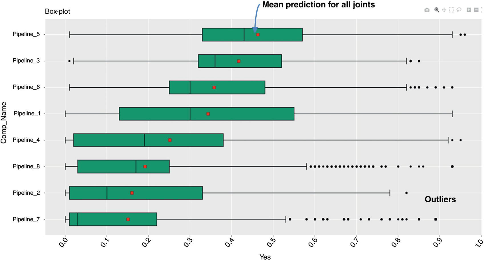
3.3.8 Apply Model and Application of Results

3.4 Supervised Learning—Regression
3.4.1 External Corrosion Growth Rate Use Case
3.4.2 Training Data
3.4.3 Select Method and Learn Model
Example EC_mpy Predictor
ANN.PRCP.NORMAL
ANN.TEMP_DIFF
Coating
Comp_Distance
CP_Off_Trend
Crossing_Water
Depth_Cover
Linear.Water.Crossing.Distance
NUM_STRUCTURES_PER_100SQM
Overhead Power.Crossing.Distance
Railroad.Crossing.Distance
Road.Crossing.Distance
SOIL_CORROSIVITY
SOIL_DRAINAGE
SOIL_EROSION
SOIL_PH
SOIL_TYPE
VALUE_AGRI 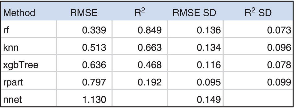
3.4.4 Model Testing
3.4.5 Unity Plots
3.4.6 Learning Curve
3.4.7 Predictor Importance

3.4.8 Apply Model and Application of Results
3.5 Unsupervised Learning
3.5.1 SCC Susceptibility Use Case
3.5.2 Training Data
Example SCC Predictors:
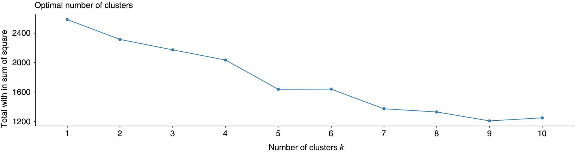
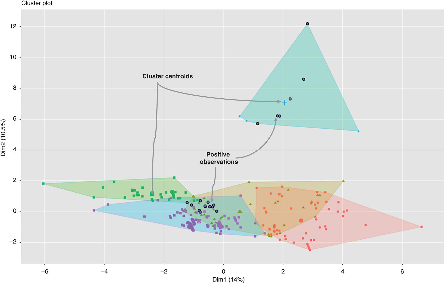
3.5.3 Cluster Analysis
3.5.4 Predictor Variance Analysis
3.5.5 Partition Analysis and Best-k
3.5.6 Perform k-means and Plot Analysis
3.6 Final Thoughts
3.7 Summary
References
Bibliography
Note